
ItsaCheckmate Menu Management UI
Product Design
Concept Video
Introducting ItsaCheckmate Integration
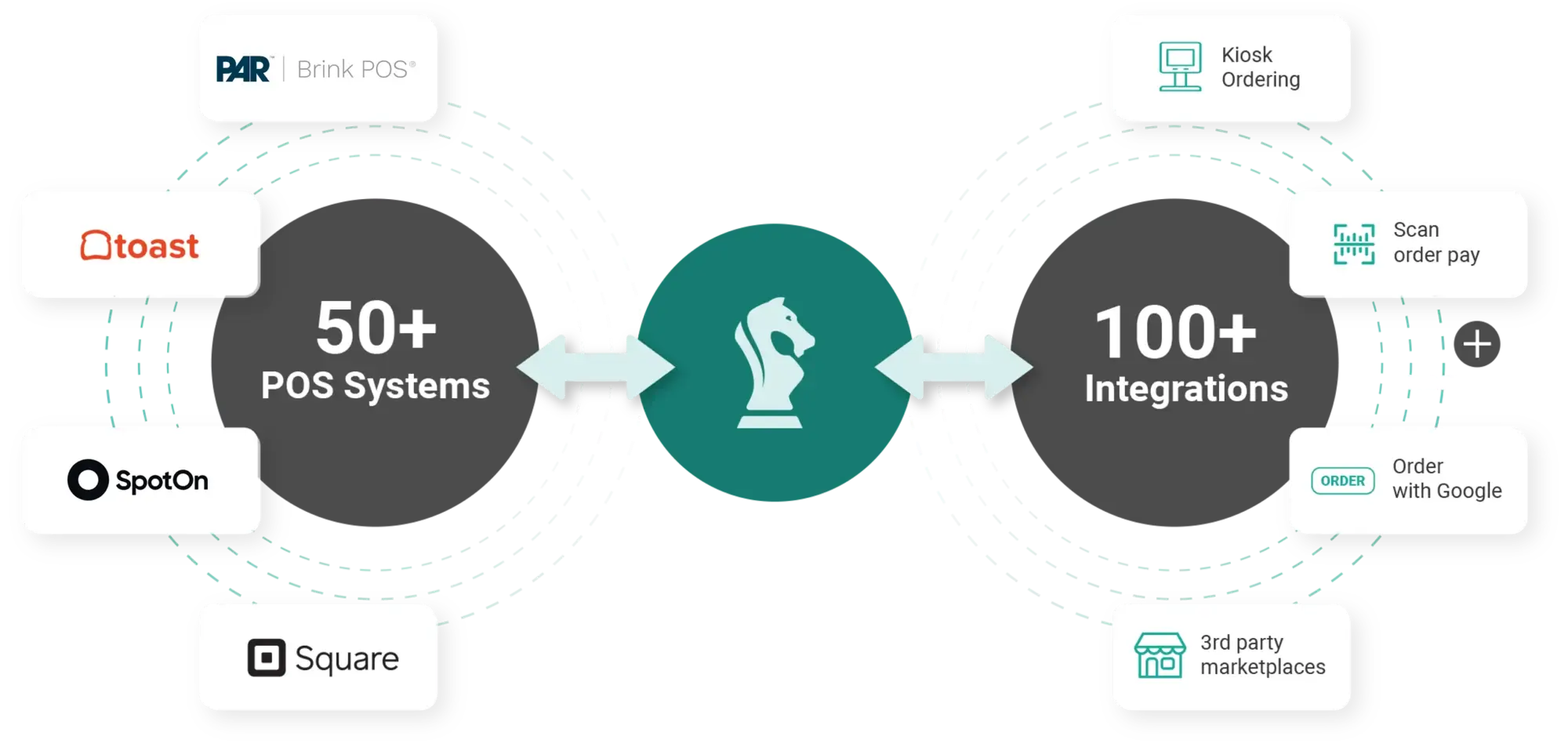
ItsaCheckmate was an early startup and their core product was integrating 3rd party delivery services like UberEats, DoorDash, and Grubhub with restuarant point of sales (POS) system. Guests would make the order online via the 3rd Delivery Platform, and the order is sent to ItsaCheckmate where the each menu item is validated with the POS menu. Once validated the order is directly injected into the POS.
My very first task on the first day joining the company was to create a concept graphic that best visualized the company’s core product.
Problems of Multiple Ordering Platform Menus
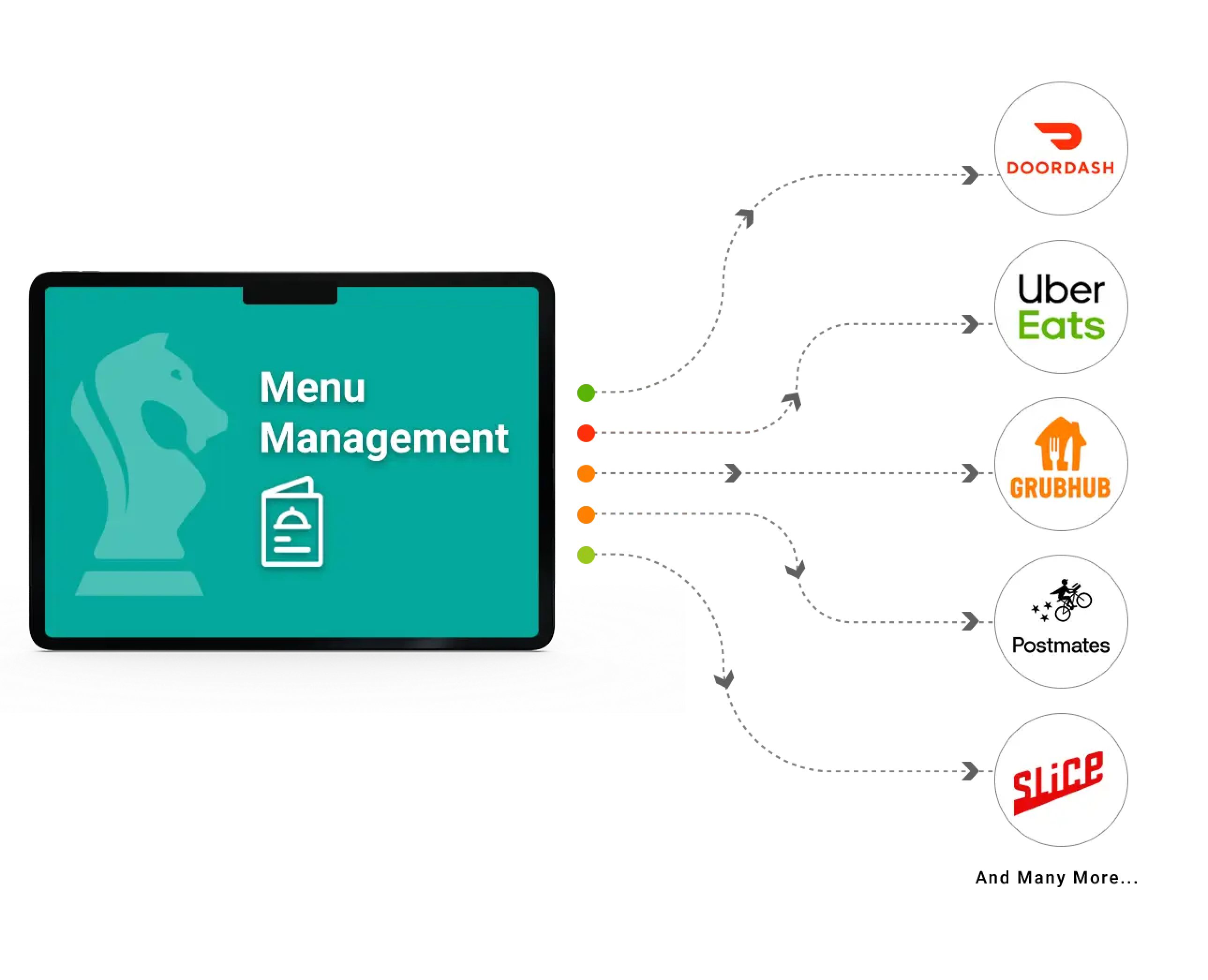
Although ItsaCheckmate core product solved one end of the integration for orders, the next problem is to solve for menus. Restaurant operators were still having pain points trying to update menus on different ordering platforms. Oftentimes, restaurant operators have to log into different ordering platforms to update an item price as an example, and it becomes cumbersome and hard to keep track. Menu Management UI was the solution to one stop shop for managing all the ordering platform menus. Restaurant operators can make any changes to their menu, and push the changes to all their integrated ordering platforms.
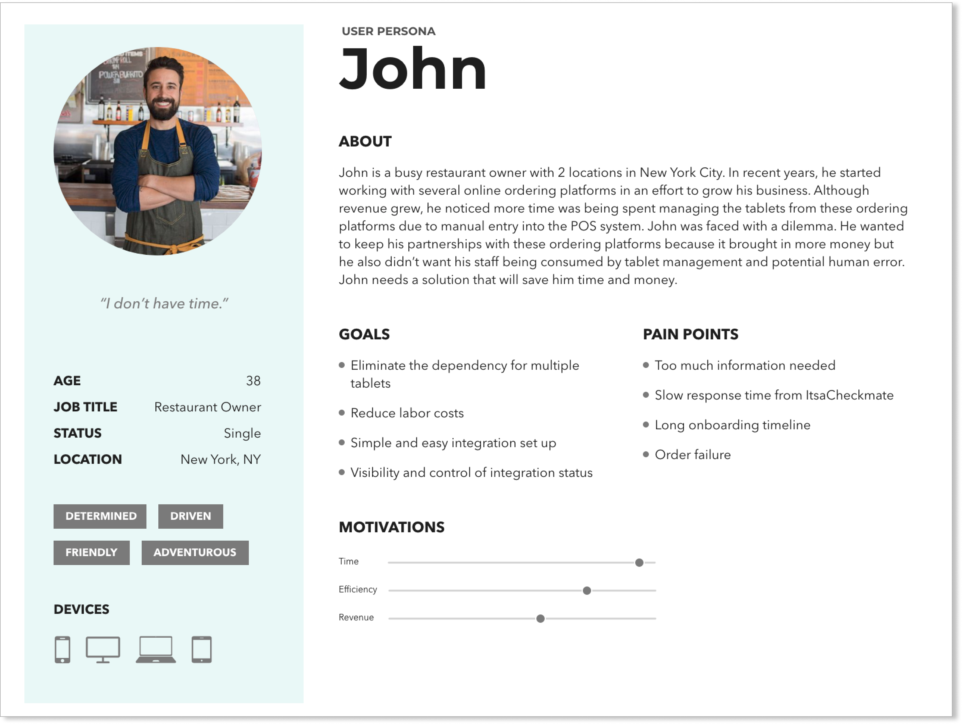
The Focused Users: Mom and Pops Owners
Before designing the UI, first I had to understand who were the users and what are their needs. I had the opportunity to collaborate with some Small-Medium Business (SMB) customers, aka "mom and pop". I was able to get direct feedback about their needs and pain points in managing menus on different ordering platforms. From their feedback, I was able to construct user persona that was very important to me when I start on any design project related to the Menu Management UI.
Conceptualizing the Experience
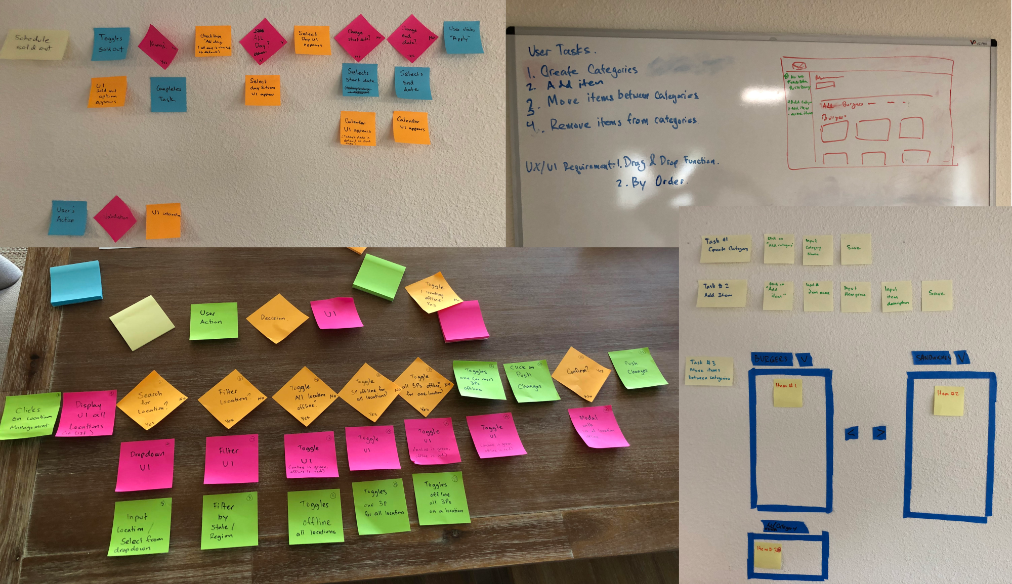
I did some brainstorming sessions, walking through the experience of a restaurant operator, and figuring out what would make their job more efficient when using the Menu Management UI. I thought about how they will log into the portal, navigate through the user interface, and what features they will use to manage the menu.
Creating the User Journey
Then I map out the user flow to put together a journey that will help restaurant operators better manage their menus for all their integrated ordering platforms. The first feature I designed was marking an item sold out. In the restaurant industry, it’s called 86-ing an item or a modifier. This feature is very critical to the customers because they don't need to go to each of their delivery service platforms to mark an item sold out. The customer can just do it in Menu Management UI, and push the updated menu to all their integrated ordering platforms.
Medium Fidelity Layouts
Because Menu Management UI was a brand new product, I had the opportunity to design the UI from scratch. I decided to go with the desktop-first approach because the company’s engineering team was focused on building web-based apps that can be accessible in a browser on any device. I experimented with different layout designs and presented the design to the company founder in medium fidelity wireframes to get a better understanding of usability. We decided on option 3, a design that the restaurant operators are very familiar with and will be able to scale for the future growth of the Menu Management UI.
High Fidelity UI Design
After the layout was decided, I proceeded to add some visual elements to bring the Menu Management UI to life. In the subsequent sections below, I will break down into details of some of the components related to marking an item sold out in Menu Management UI and pushing that update to the ordering platforms.
Menu Item Card
For displaying the restaurant menu, I decided to go with the menu items showing as cards in a grid layout. The item card shows some basic information such as the name of the item, price, and the image. Because marking an item sold out will be the most used feature on Menu Management UI, I decided to add the toggle button on the item card so restaurant operators can see the menu and easily switch an item from “available” to “sold out”.
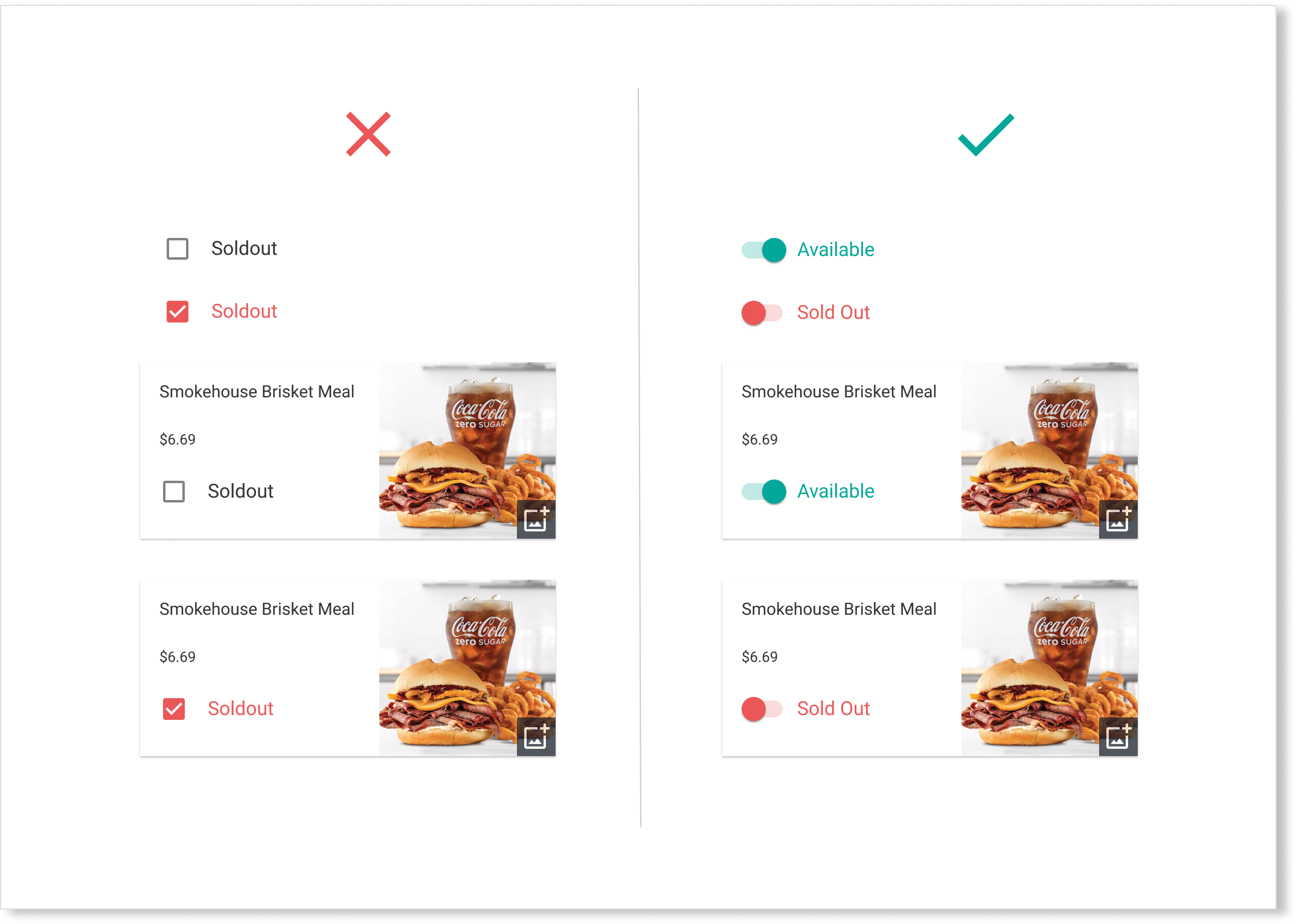
Toggle Sold Out Button
In several design iterations, I explored different UI elements that would create the best user experience for restaurant operators when marking an item sold out. I narrowed the design down to a checkbox and a toggle switch button and did A/B design testing. Based on testing feedback, the user testers found checkbox very confusing and often mistake for an item being sold out. Also, the checkbox represents selecting an option with a purpose that it will be interacted with infrequently. Whereas toggle switch is like a physical light switch that restaurant operators can easily switch an item being “available” or “sold out” on a regular basis. In addition, the visual display of the toggle switch is more clearer with green color that represents an item “available” vs. red color for an item “sold out” and creates more attentiveness so restaurant operators can easily glance at which items are sold out.
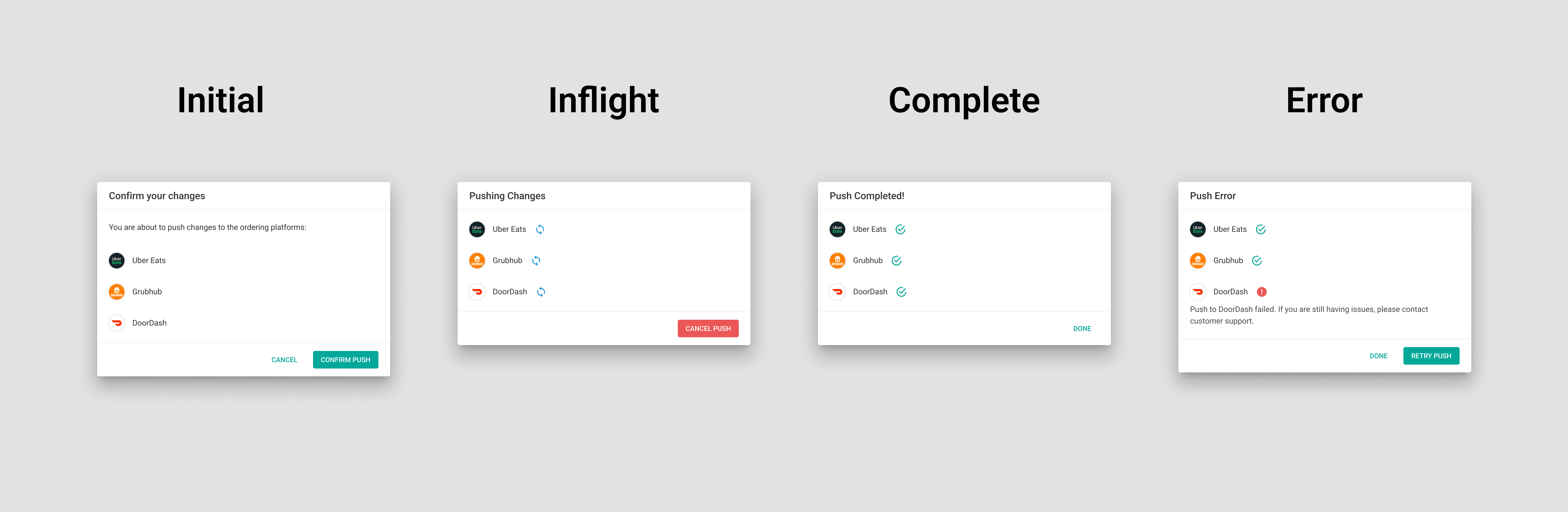
The Modal Flow
Once a restaurant operator makes changes to the menu in the Menu Management UI, the final task is to push the menu to the ordering platforms. To represent this experience, I decided to use the traditional Modal Flow, a process series of modal dialogs to help restaurant operators walk through the simple process of pushing the changes and seeing the process being completed, or shown in error when there’s an issue.
The Next Steps
The implementation of marking an item sold out became an instant success for the company, and many more features were added to the Menu Management UI. Because the company was growing at a phenomenal pace, I became more focused on growing the design team. As a design leader, I established systems and structure for my expanding team to ensure efficiency and scale.